Creating Conceptual Plans in Lumion
- Dec 7, 2020
- 9 min read
Updated: Dec 23, 2020
With the introduction of the Orthographic effect in Lumion 11, it's now possible to create a whole new type of visualization in Lumion. In this article, I'm going to take you through how I create these types of images and why they continue to be one of the most effective ways to illustrate architecture.

Orthographic projections have, and continue to be, one of the most popular methods of illustrating a technical design. By illustrating three-dimensional shapes in a two-dimensional format, we’re able to understand the forms and functions of a building much more clearly.
I like to think of orthographic drawings as a ‘hybrid’ illustration. It capitalizes on the strengths of both mediums to allow a fuller and better-rounded interpretation of a building’s design.
Over time, many design professionals have adopted the art of perspective drawing in their workflows to demonstrate a design with some graphical finesse. My favorite examples of these often come from landscape designs, such as this example by The Figure Ground.

These colorful and loosely detailed plans take subjects that would normally require huge levels of detail to accurately portray, and simplifies them in a way that allows any viewer to interpret the designers ideas.
There’s a certain beauty in this simplicity that can often get lost in place of the visual perfection most Architects look for in their visualization workflow.
I think there’s a place for both types of visualization. Photo-realism is great for end-stage visualization. Being able to take a refined design and illustrate it in a way that’s relatable for a potential buyer is invaluable.
Conceptual visualization, such as the orthographic plans we’re talking about today can be thought of more as an adaptive design tool. Something that allows us to visualize an idea in its rawest form and focus our viewer's attention on the key functions rather than insignificant details.
This is the best thing about the Orthographic feature in Lumion. We now have the opportunity to merge these two tools. We can create a model that’s used for design and idea conceptualization, and then refine it along with the design process.
It’s the reason that this feature was on the top of many people's wish list, and it’s great to finally have it available.
I’ve taken some time to explore the art of orthographic projection to bring this into my own workflow. In this article, I’m going to take you through how I created this concept plan using only a handful of steps.
Let's get started.

Step 01 - Understand Your Goal
You don’t have to have an exact idea in mind, but understanding what it is you want to show in your image ensures that you’re able to optimize the scene to suit your specific needs.
For this tutorial, we’re going to use the Farnsworth house example scene, and I’ll be creating a basic site plan that aims to show the building's location with respect to its surrounding environment.
I wanted to capture the beauty that many hand-drawn plans tend to have, so I’m going to adopt more of an artistic conceptual aesthetic for the final images.

Like always, starting with some references is a great way to understand what your final image could look like. I put together a few references that I liked which demonstrated both the layout and artistic style that I was aiming for.
I’ve always loved Studio Ghibli's animation style, and figured this might be a great opportunity to try something like this out!
Step 02 - Optimizing the Scene
One of the main reasons I recommend establishing a goal early in the process is so that we can optimize the scene to best fit that purpose.
When it comes to the orthographic effect, I find that not all models are made equal in terms of how they present, especially foliage models which tend to have some degree of randomness.

If we take a look at this site plan by Towers Golde, we can see that for the most part, the plants take a symbolic shape, with relatively symmetrical attributes. This lets the viewer identify each element individually, providing a happy medium between artistic and technical presentation.
In the case of the Farnsworth house where the majority of the foliage is ‘natural’ rather than manicured, we can get away with a more relaxed approach. However, if creating a landscape or master plan design which requires a more accurate approach, it’s important that everything is kept neat.
There are a large variety of assets in Lumion that present nicely from an aerial view, making them perfect for illustrations such as this.

I recommend you try a few of these out on your own to test what suits your needs, but above are a few of my favorite trees I’ve used so far for Orthographic plans and they’ve worked great.
Depending on how complex or artistic you plan to be with your render, you may need to spend a little more time optimizing your model and scene so that it suits your particular look.
This can mean adding thickness to terrain for cross-sections, simplifying or enhancing the building model, or altering certain elements that may interfere with your projection.
For this scene, I wanted to show the interior plan of the building in addition to its placement on the site. Since the Farnsworth model within the example scene can’t be edited, I decided to replace this model with one that better illustrates the interior. If you’d like to download this model for yourself it’s available here on the 3D warehouse.
After cleaning up the model to remove any unwanted elements I imported it back into Lumion ready to start developing my scene.
Step 03 - Camera Setup
In previous versions of Lumion, creating a perspective based image such as a site plan or orthographic projection was almost impossible. With the introduction of the Orthographic effect, we now have much more control over how the camera behaves when creating these perspective-based images.

For this site plan, I wanted to make sure that I was able to show a clear transition between where the building sits, where the majority of foliage sits, as well as where the waterfront is positioned.
The majority of the heavy lifting here will be with the Orthographic effect, so once we have an approximate position for our camera that shows the appropriate information it’s time to start building our effects stack.
I’m going to break this stage up into three steps; Orthographic Effect, Global effects, and Artistic Effects. This will make it easier for you to choose which effects apply to your particular scenes and which don’t.
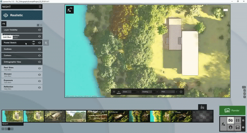
Step 04 - Orthographic Effect Setup
The Orthographic effect is quite intuitive once you understand the basics. If you’re completely new to this effect, I recommend checking out Lumion’s tutorial video here which covers everything you need to get started.
There are no real guidelines when it comes to setting up the orthographic view, other than doing what’s right for your particular render.
In creating these examples, I spent a bunch of time experimenting with different viewing angles. Some of the different looks that can be achieved by moving the sliders within the effect are very unique and it’s a lot of fun to just try different views out.

In the end, I opted for a 90 degree ‘top-down’ plan view. I think this is the best way to show larger areas and provide a sense of scale to the building and how it fits into its surroundings. I also think it’s one of the cleanest ways to show a lot of information in a single image.
One of the handy mechanics of the Orthographic effect is the ability to snap to a surface. It may not be suitable for Axonometric views, but for plans and elevations, it’s a nice time saver.

After setting up the view in the Orthographic Effect, be sure to save your render view by using the Store Camera function.
Step 05 - Global Effects
The effects stack is another area that benefits from having a clear understanding of what you’re trying to achieve.
Since my image is going to be of a more conceptual aesthetic, photo-realism isn’t as important. This means that I can spend less time fine-tuning the photo-realistic aspects of the image since these will most likely be covered by the artistic effects we apply later.
One of the great things about using a conceptual style is that it allows the viewer to focus on shape, form, and function rather than getting caught up on details of photo-realism.
Understandably, if you’re going for a more photo-realistic effect (which gives amazing results too!), you may need to spend a little more time here. Simply set the scene up as you would normally for a 3D render and you’re done.
The beauty of creating orthographic renderings in Lumion is that it allows for both conceptual and photo-realistic renders to be developed simultaneously with very little effort needed to switch between them.

To get a basic lighting setup underway I simply selected a style that best suited the look I was aiming for. The Realistic style did this, but any of the Styles could work as long as they provide some Light, Shadow, and Color Correction effects to work with.
Step 06: Artistic Effects
The artistic effects are an area of Lumion that’s long been ignored in my workflow. In all honesty, I just didn’t see many applications for it that made sense after putting so much effort into making a scene look photo-realistic.
With Orthographic images, however, the artistic effect has become much more relevant.
The artistic effects in Lumion are, collectively, perhaps the most versatile effects available. Before I discuss what effects I’ve used I want to take a minute to explain how these effects work.
Their versatility comes from the way that they follow a hierarchical structure inside the Lumion effects stack. This means that depending on where the artistic effects sit on the list, this will determine how they influence the image.
The result is that we can prioritize certain aspects of each effect without being restricted to the settings of any one effect.
To demonstrate what I mean by this, let’s take a look at the example below:

The image on the left has the Pastel Sketch effect prioritized over the Outlines effect meaning that the outlines within our image are being influenced by the Pastel effect. If we swap these, however, we can now maintain the color style of the Pastel Sketch effect, whilst also prioritizing the Outlines effect to offer more control over the way outlines present in our render.
This method can be extended to almost every artistic effect in Lumion which expands on the versatility of this style of rendering substantially.
For this scene, I wanted to capture the hand-drawn aesthetic described above. To get this, I experimented with various artistic styles before dialing in on a winner.

The main effects that were used to establish this look were the Outlines and Pastel Sketch Effects. Prioritizing the Outlines effect ensured that the clean crisp lines were present on the floor plan and building area. This helped enhance the building’s presence on the image without taking away from the context of what I was trying to achieve.
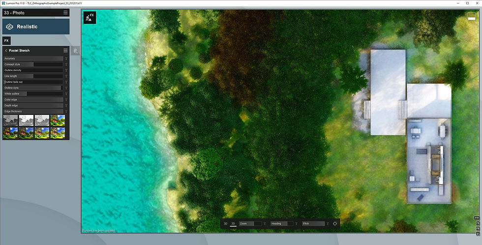
The Pastel Sketch effect allows for some unique color and texture combinations In the image which were perfect for this style. This is a big effect, so I think it’s best to cover this in another article. In the meantime, I recommend experimenting on your own using any of the example scenes to see what you’re able to produce!

The Outlines effect was used to define the outlines of the building elements, as well as adding in some overdraw for some extra flair in the final image. Increasing the Transparency slider here allows the color of the Pastel Sketch effect to show beneath the lines.
Step 07: Finishing Touches
The finishing touches on this were added purely as a personal preference to help fine-tune the image to a point I was happy with.
I found it helpful to place the Color Correction effect at the top of the effects stack. By doing this, I was able to prioritize the Color Correction effect as the primary source of color adjustment.

I find the color settings inside the Artistic effects to be a little tedious, and so being able to work in a familiar space such as the Color Correction effect offered much more control.
As well as this, it allows for additional tweaks to be made after the artistic effects are established.

To help focus the viewer’s attention, I also applied some blur to the perimeter of the image. It blows me away how much depth this adds to the final result and I love the way it prioritizes the details around the building.
TIP: When applying blur effects to an orthographic perspective, using the tilt shift effect will create a linear blur, whilst the Depth of Field effect creates a radial blur.
Step 08 - Finished!
After applying these finishing touches, we’re done!
I decided to animate a quick sun study for my render to show the building reacts to it's surroundings. It's amazing how powerful an aerial perspective can be in analyzing this aspect (Not to mention it also looks super cool!).

Creating orthographic illustrations is such a quick process that can be done at any point during the design phase with very little effort.
I’m looking forward to exploring both the artistic effects and the orthographic effect in future projects, and I can’t wait to see what other users are able to create!
Here are a few examples of how I’ve been able to use the artistic and orthographic effects to create some interesting imagery:


Did you find this article helpful? Want to learn more? Let’s talk.
Head over to The Lumion Collective Facebook group and join the discussion!
Until next time, take care!
Comments