6 Keys to Photo-realistic Renderings in Lumion
- Sep 1, 2020
- 7 min read
Updated: Oct 4, 2020
Looking to create photo-realistic renderings in Lumion? Here's 6 key elements that will help guide you there.
"How do I make my renderings look photo-realistic in Lumion?"
It’s a great question, and one that I also asked for a long time. The problem is, there’s no one answer.
The creation of photo-realistic rendering is a result of various elements coming together in synergy.
It relies on mastering a variety of skills that take patience and years of practice.
Lumion has tried to speed this process up through the use of Styles, and these do a great job of quickly getting you an ‘ok’ looking image.
Don’t get me wrong, the styles are a very impressive addition to Lumion. They’re perfect for producing a rendered image in no time at all and if efficiency is the goal above all else, they’re unbeatable. Simply set your camera view, apply a style, and click render. Done.
So what’s the problem with relying on styles?
If you’ve been using Lumion for a while now, you’ll no doubt have noticed that the images that are rendered using this method aren’t always perfect.
The reason for this? Well, let me reiterate something I mentioned earlier:
There is no one answer.

Pre-set functions rarely, if ever, translate perfectly across all projects.
Using a pre-set might allow us to create an image that’s ‘good enough’. The problem is that ‘good enough’, doesn’t stay good enough for long. To get accurate and believable results in an image, a tailored approach is required.
So how do we bridge this gap? How do we take a rendering from ‘good enough’ to amazing?
Well, I’ll start with the advice that many probably won't like to hear:
Practice makes perfect.
The more images you create, the more attuned you’ll become to what is required to produce photo-realism In your images.
From my experience, however, preaching the importance of practice without any sort of guidance will leave an aspiring artist stuck in a loop of frustration. When I started learning arch-viz, I would create image after image that made only marginal improvements in quality and it left me feeling underwhelmed and unmotivated.
So, to help you skip some of this frustration, I’ve put together a checklist of some of the key elements to be aware of when creating a photo-realistic image.
These aren’t ground-breaking discoveries. They are, however, solid fundamentals that can be utilized in every single image you’ll ever create.
Let’s get started.
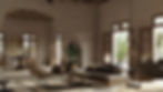
Whether you love it or hate it, lighting is the foundation of photo-realism. It’s arguably the most powerful feature in an image, shaping almost every aspect of the scene. The balancing act that is light and shadow is the heart of photo-realism. Not only does it portray the physical characteristics of the scene but it also helps shapes the viewer's interpretation of what the image is trying to illustrate.
When it comes to lighting in your scenes, It’s important to draw on reference images wherever possible. Our brains are notorious for inaccurately interpreting light behavior, so having real-world examples to draw on is essential to getting this step right.
Since it is such an integral part of the process, it’s no surprise that it’s also the most complex and time-consuming element as well. Lumion has a range of tools that can be used to facilitate this process. It’s a fairly large topic to cover, so I won’t go too far into it in this post.
If you’d like a more comprehensive guide for understanding how the lighting systems in Lumion work, I’d recommend checking out this free Lighting in Lumion PDF by The Lumion Collective. It’s 50+ pages of information that will help build a solid understanding of the technical aspects surrounding lighting and how these can be applied to your Lumion scenes.
Preparation is key. The quality of your render starts with the quality of your models and when it comes to illustrating a subject as technical as architecture, the importance of realistic models is increased tenfold. The best approach here is to use references.
Amazing 3D worlds start with the real world. Having a detailed understanding of what it is you’re trying to model will allow you to capture the intricacies that are present in a physical environment.
I’m planning to explore this more in the future and unpack some of the secrets to establishing realism in the modeling phase. In the meantime, I’d recommend employing a Level of Detail (LOD) workflow that utilizes high-resolution models in the foreground, and low resolution in the background.
This helps to prioritize different parts of the scene based on what requires the most attention to detail and prevents us from over-complicating the modeling process.
Like modeling, texture quality is another essential part of the process. Pixelated, seamed, or blurry textures will quickly detract from the realism of a scene.
Building convincing textures from the ground up is a complicated task. There’s an entire craft dedicated to creating realistic materials, so it’s understandable if this is not your area of expertise.
Fortunately, another benefit of Lumion is its internal material library. This has a variety of high-quality materials right out of the box that are optimized for use in your renders. The quality of the Lumion material library has improved significantly in recent years thanks to the implementation of Poliigon textures, with over 250 of these materials being available for use at the time of writing this article.
If you’re after specific materials that aren’t present in the Lumion library or have requirements for advanced materials there are also options for creating custom textures. The workflow for creating custom PBR materials in Lumion is a little cumbersome compared to other rendering engines, however, once the process is perfected the results can be extremely convincing.
Whether using the internal library, or custom materials, the goal should be to emulate the properties of the real world. Once again, references are your friend here. Pay special attention to real-world scale, positioning, reflectivity, and glossiness when creating materials.
Be sure to save these materials for future use, either by exporting as a .LNM file, or by using the ‘favorite’ function in the material editor. As you build your own material library, the workflow of texturing a scene will improve drastically. I’ve got a handful of materials that have been re-used for most of my projects and I can’t tell you how much time this has saved me.
Color is an underrated aspect of photo-realism among many Lumion artists. It’s commonly thought of as an artistic choice, so finding a balance between capturing the tone of an image whilst also maintaining realism can be a difficult task.
Real-world references are a great starting point for understanding the way that color behaves. It’s heavily influenced by lighting and can be studied by simply analyzing the world around us.
Lumion has a color effects panel inside the render menu that can help shape our color choices in an image. In this effect, we are given the basic tools needed to make improvements to the color of an image.
Once again, I’ll save the details of these settings for another post as there’s quite a bit to unpack here.
As a general rule, however, I’d recommend de-saturating the scene as a go-to approach. In my experience, this has been an adjustment that I’ve made to every project I’ve created since Lumion 8. By default, the saturation appears too high for most situations, and by reducing the saturation slider to around 0.9 we can achieve a much more accurate representation of the real world.
Color-correction can very easily turn into color destruction, so be sure to make only incremental adjustments to prevent overdoing any given setting.
Golden ratio, Fibonacci Spiral, Rule of thirds. If you’ve skimmed the surface of composition then you’ll no doubt heard of these and possibly a bunch of other compositional rules that can be applied to achieve aesthetic images.
It’s a big topic and one that’s constantly in discussion among the visual arts community.
I’m far from an expert on the complexities of composition, however in my research and experience over the years I’ve learned that the rules of composition are ambiguously flexible. Before trying to establish the Rule of Thirds or a matching a perfect Fibonacci Spiral, I’d recommend studying a practical approach to composition in your scenes.
By following some of the more clear cut compositional tools it’s possible to improve our compositional skills, much quicker. Understanding how to apply Focal points, Depth of Field, Symmetry (or Asymmetry), and Framing lines will help you establish a better understanding of what makes an appealing image.
Take a look at professional architectural photography to see these principals in action. I find that in general, photographers tend to place a higher value on good composition in their work than architectural visualizers. Houzz, ArchDaily, and Pinterest are my go-to resources for framing and composition inspiration as you’ll see work from some of the best architectural photographers in the business.
To get started with composition in Lumion, I’d recommend experimenting with focal length first. The render view window has an easy to adjust focal length slider that makes it easy to sample a variety of compositional styles. For most scenes, try starting with a focal length of 35-50mm as this is known to closely resemble the field of view that the human eye has. It also prevents showing too much of an image, which is a common mistake made by many architectural visualizers.
Use references! I’ve repeated this multiple times throughout this article, and that’s because I truly believe that it is essential to achieving realism.
We have physical references all around us and a limitless supply of reference images at our fingertips.
By drawing on references we not only get an idea of form, proportion, and scale but also a glimpse into the way objects and surfaces react to the world around them.
It helps us understand material properties, wear patterns, defects, and tolerances, all of which contribute to making compelling and realistic 3D imagery.
Understanding the imperfections of the physical world will make you a better artist, and this can only be achieved by studying these elements over and over again.
Conclusion
There they are! 6 elements in architectural rendering that can help guide us to the goal of photo-realism. I learn more and more about these skills with every project I work on and I have no doubt that I’ll continue to learn about them in every project I create in the future.
I plan on exploring these elements in greater detail and will update this article regularly as I create more tutorials.
In the meantime, I’d love to hear your thoughts!
Have you been paying attention to these factors when creating your scenes? How do you implement them? Join the discussion over at The Lumion Collective community group now and let me know.
See you there!